 lightGallery
Vue image gallery component
@lightgallery/vue is a native Vue 3 image gallery: every node is rendered by Vue, with v-model for the open state and the index, typed emits, scoped slots and a Teleport overlay. Animated thumbnails, pinch and double-tap zoom, captions, rotate, fullscreen and sharing come as tree-shakable plugins. The full component API is in the Vue package docs.
Demo
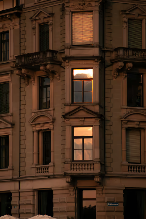
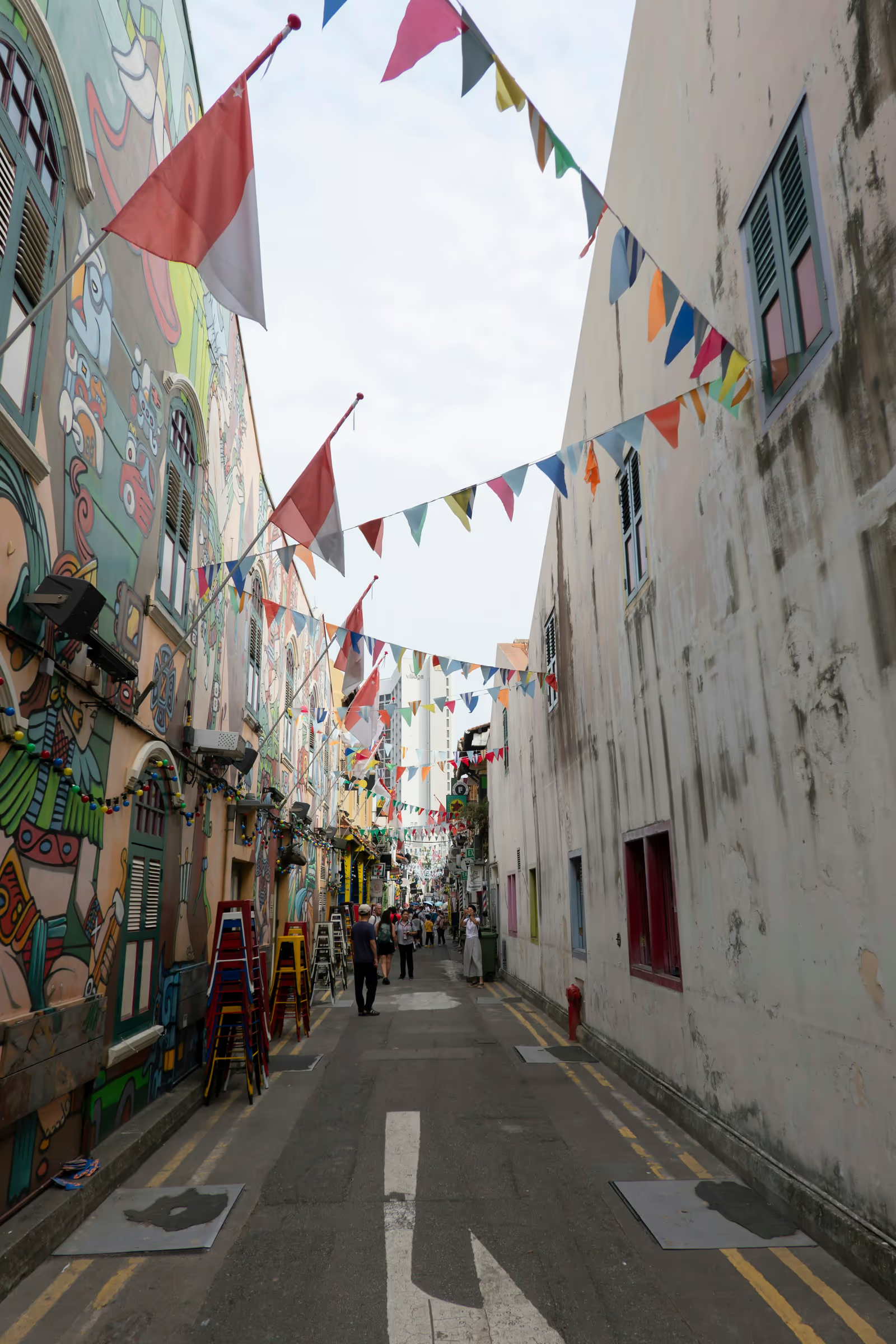
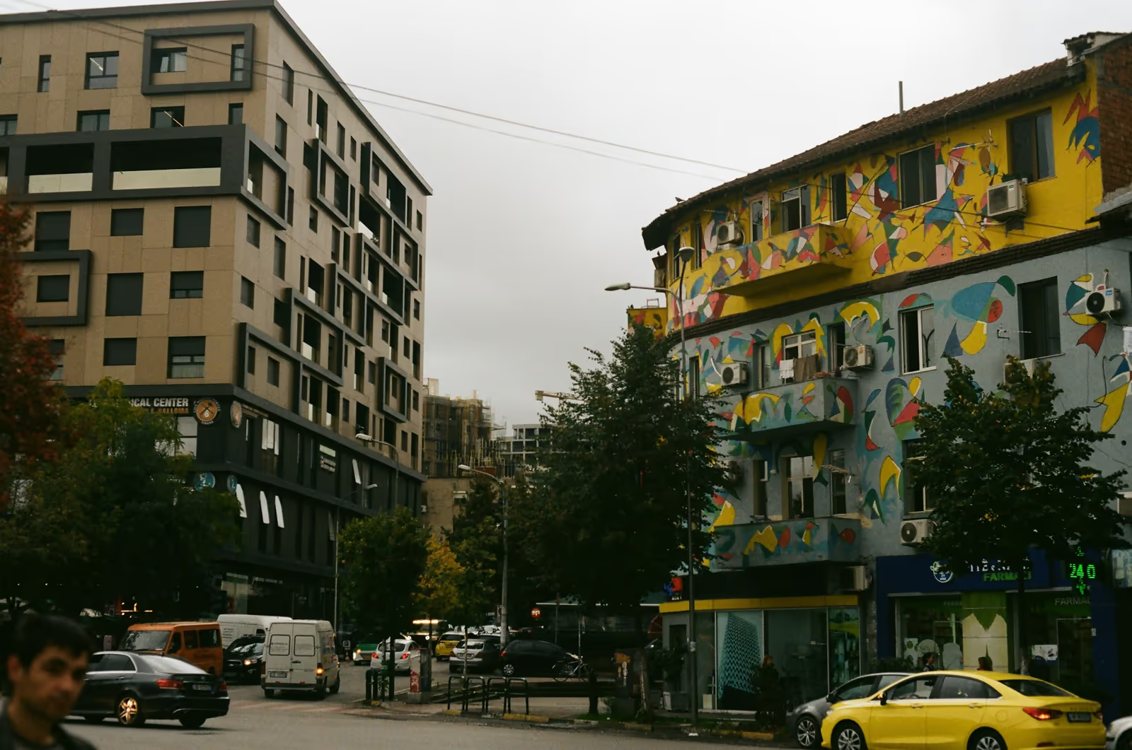
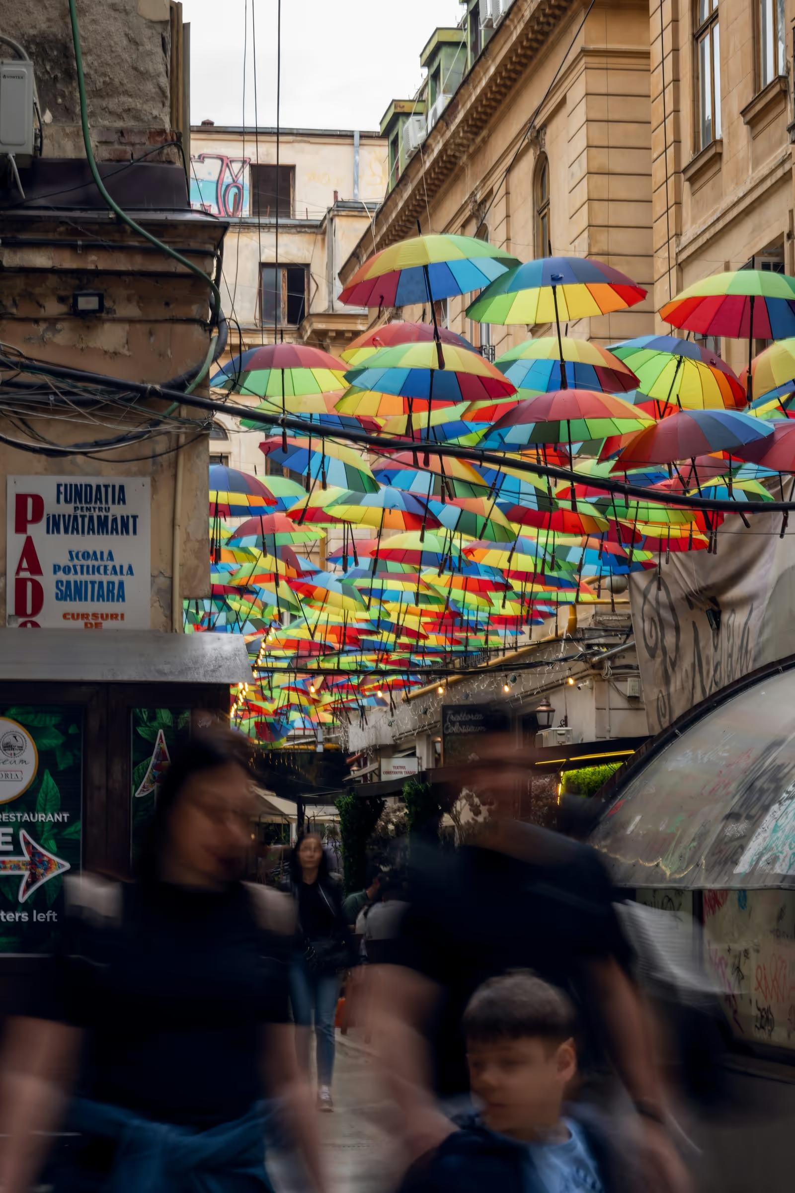
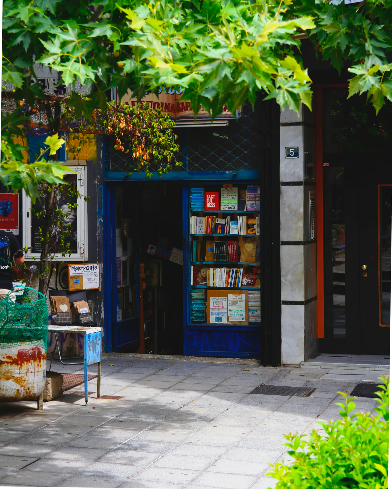
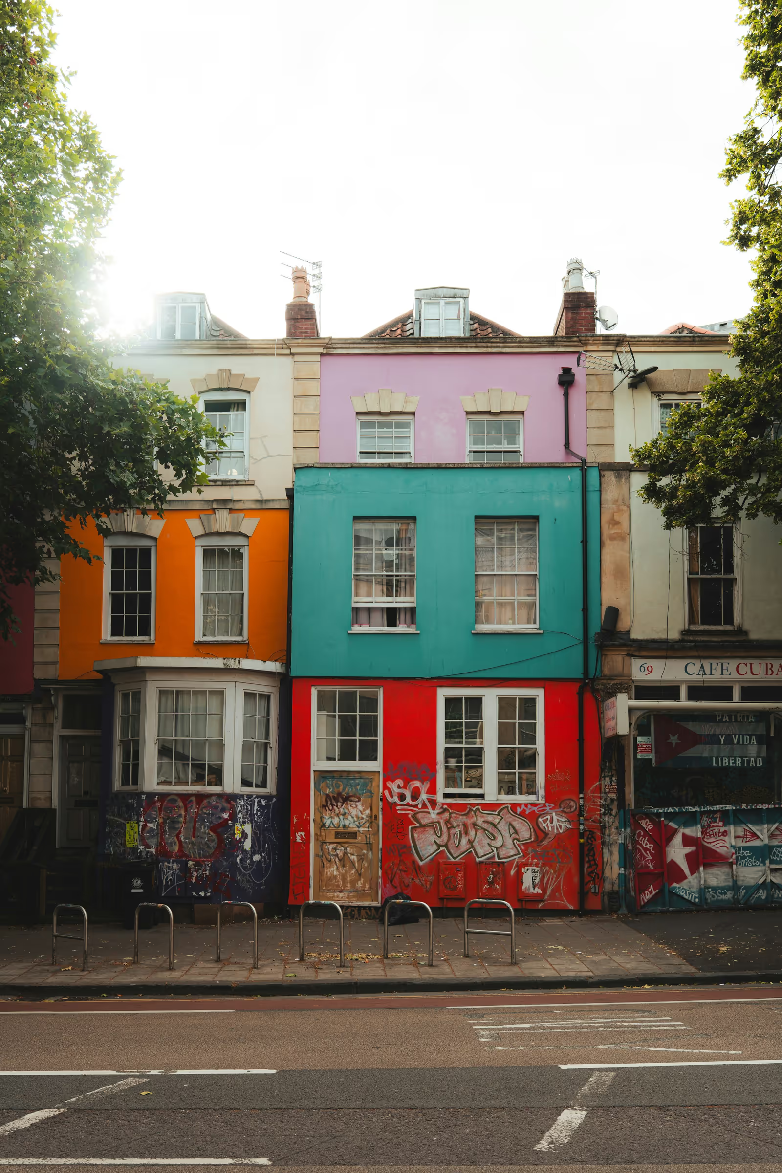
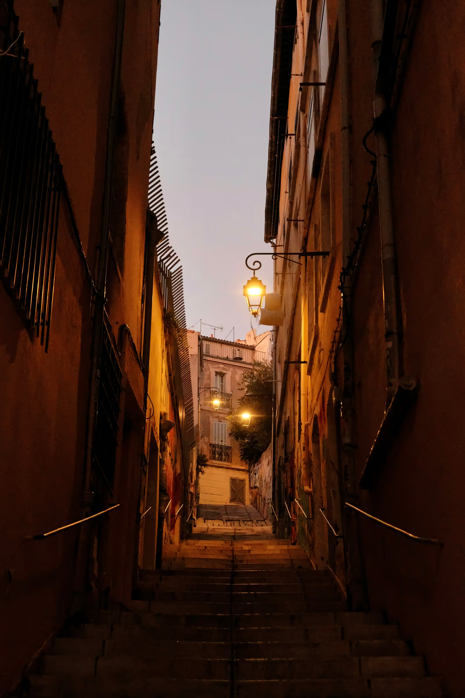
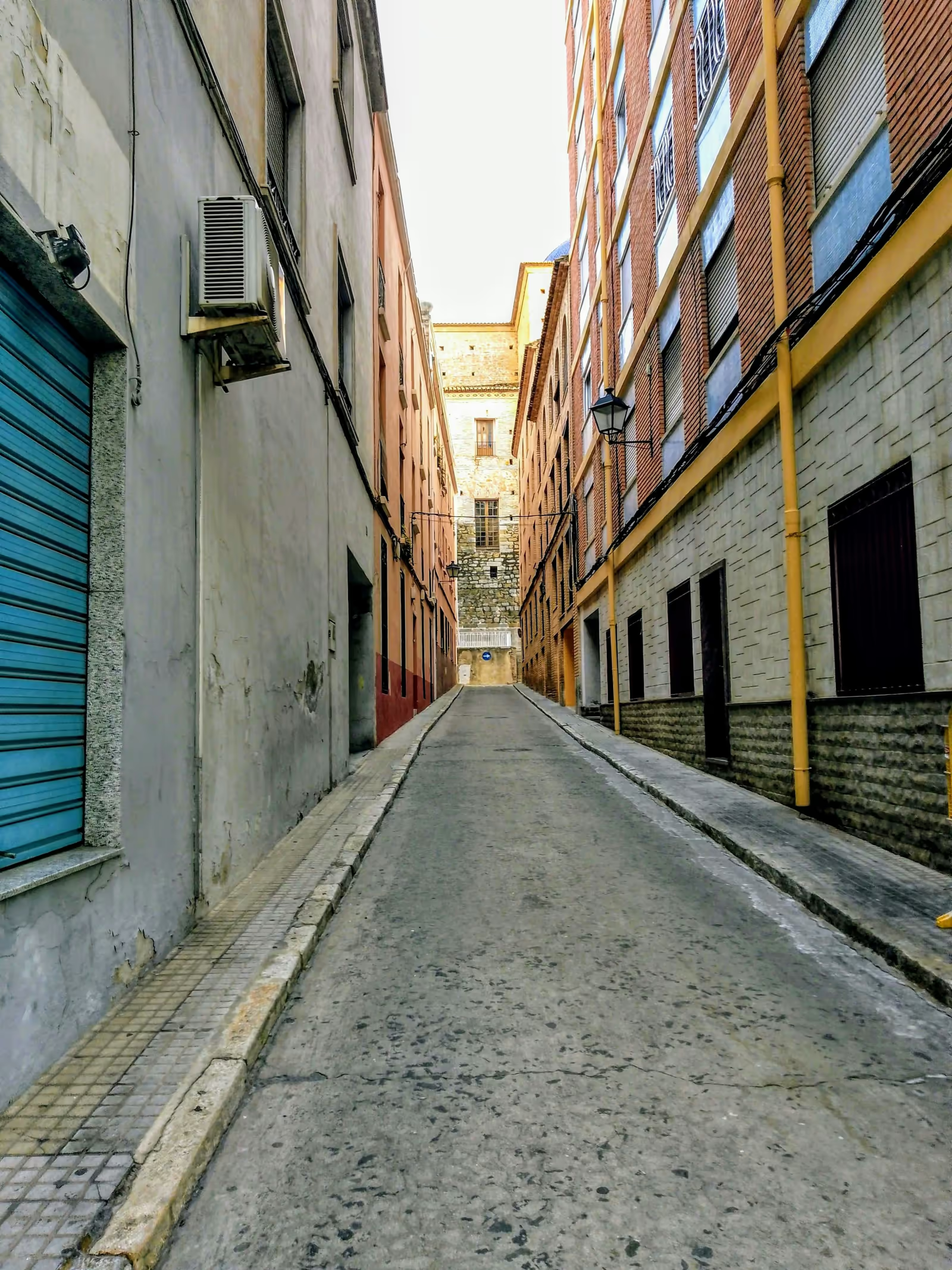
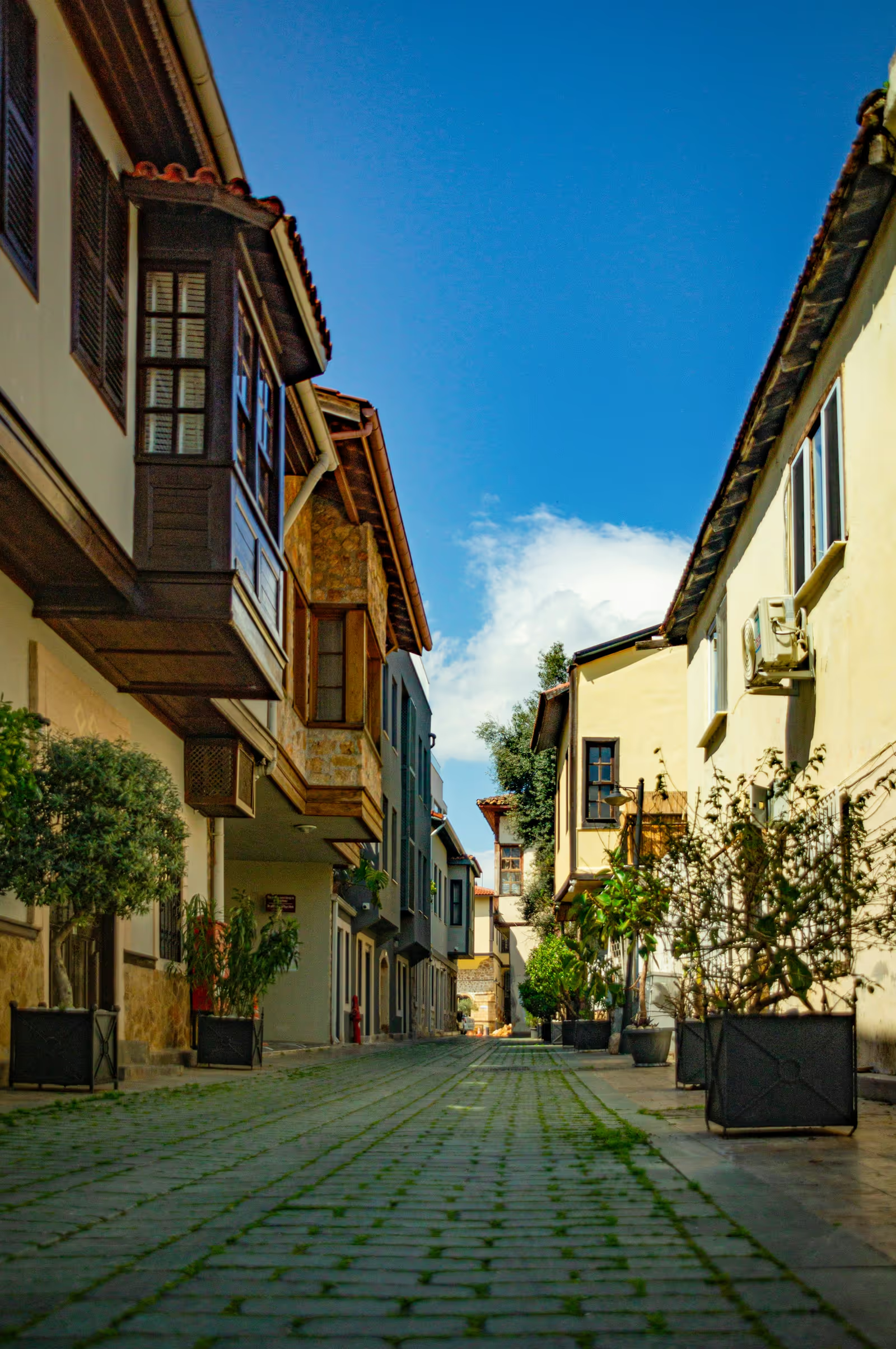
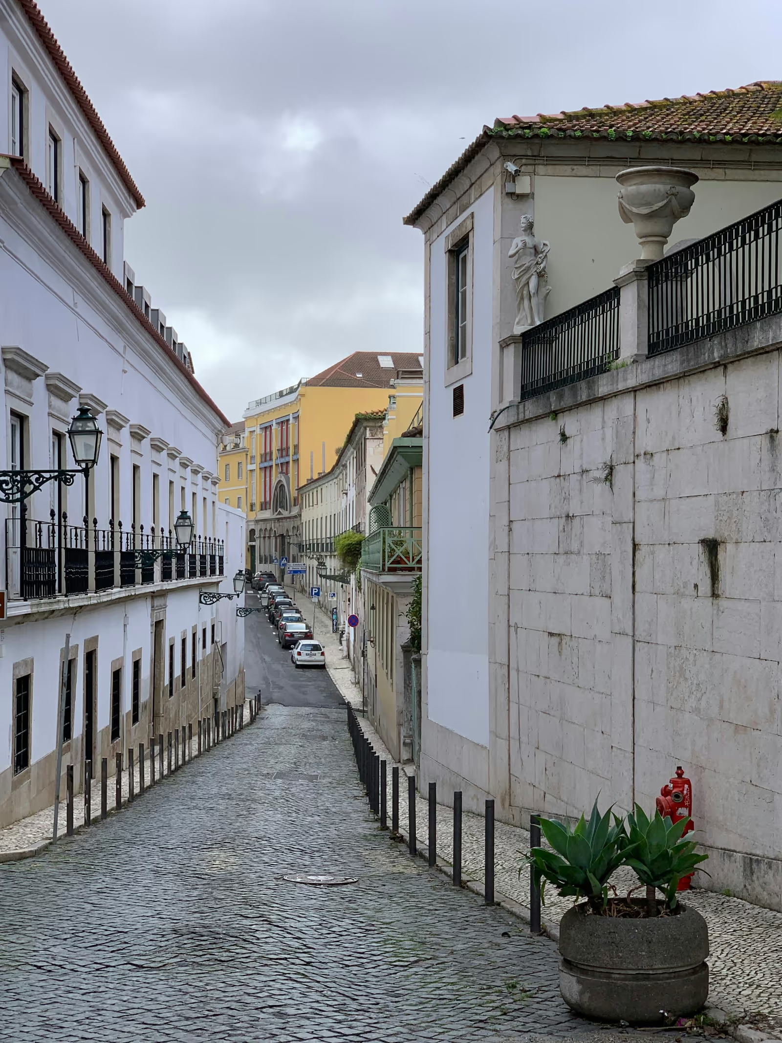
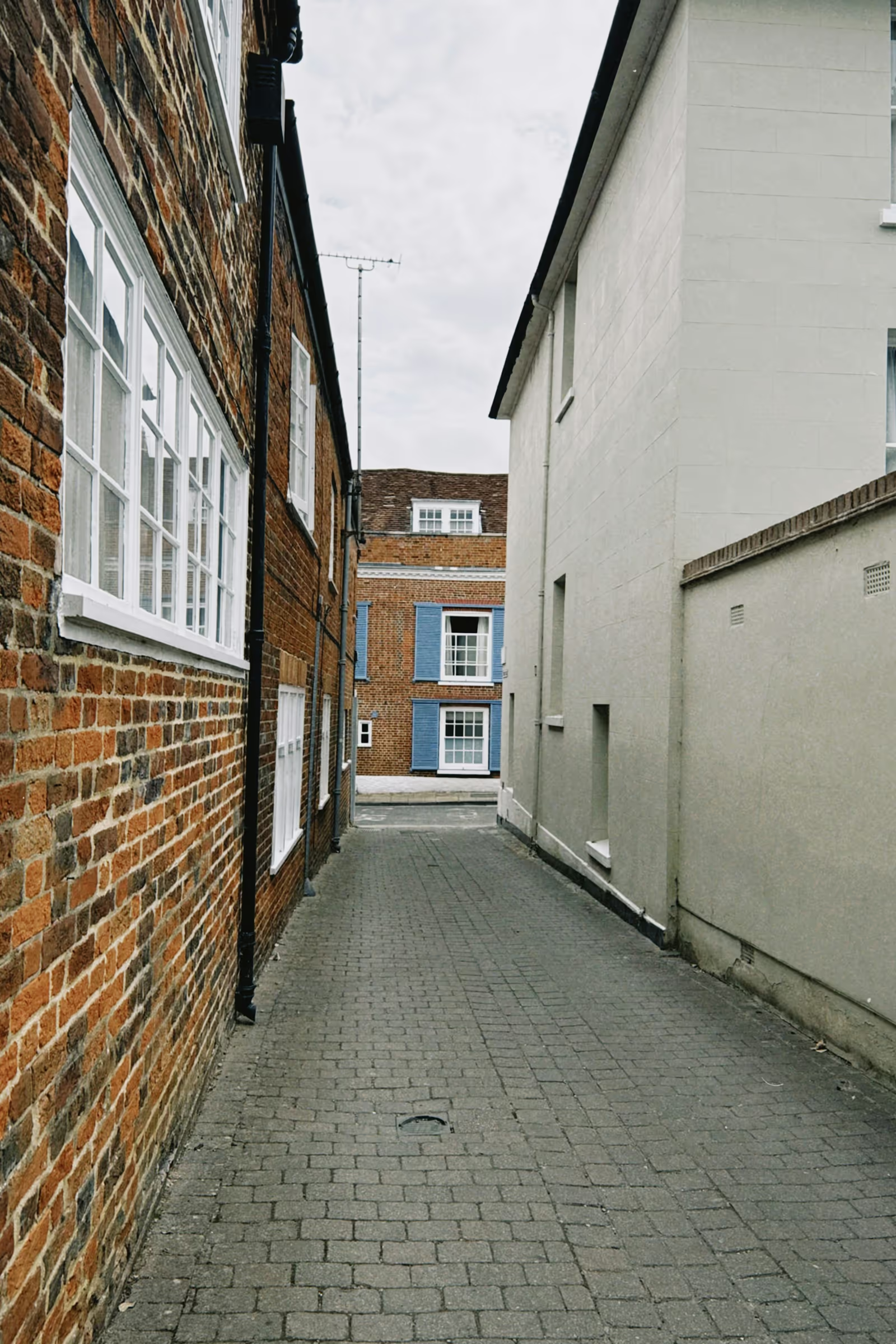
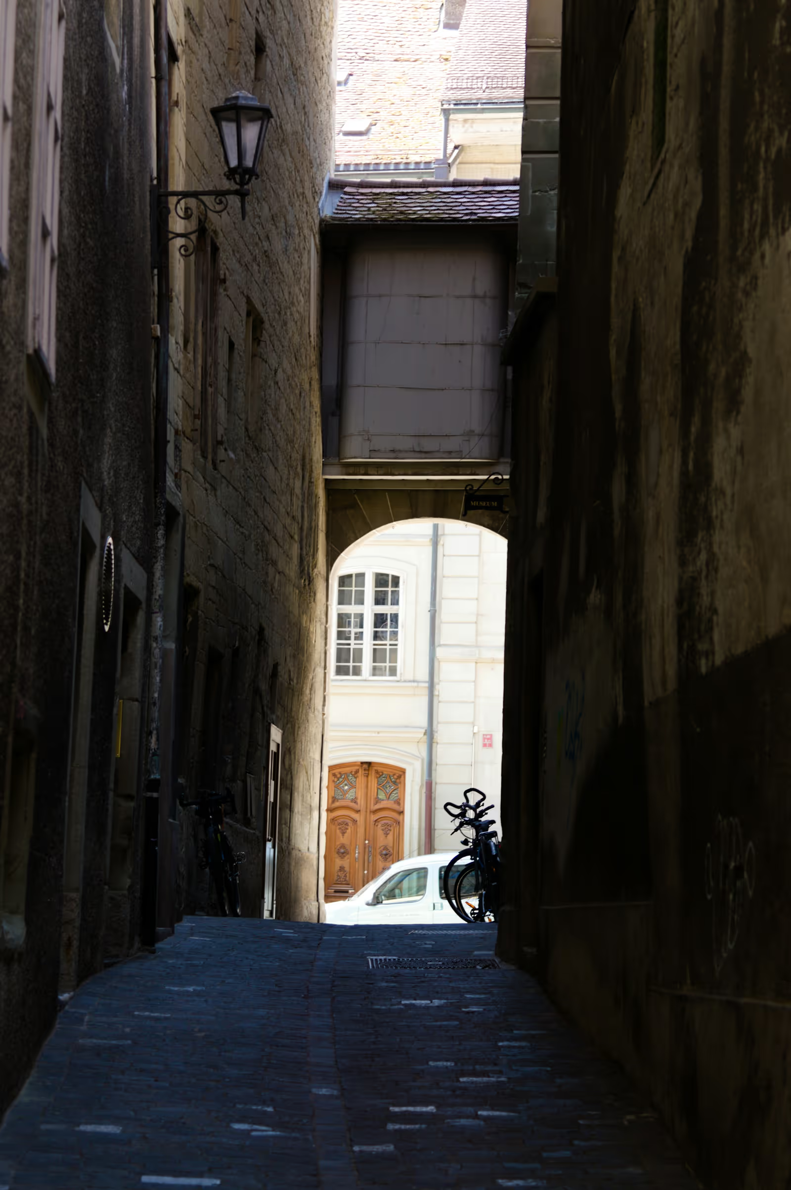
Click any thumbnail. The Vue component renders the same markup and runs the same gallery logic, the shared headless core guarantees identical behavior across all four packages.













Install
npm install @lightgallery/vue lightgalleryPeer range is vue >=3.4 (the component uses defineModel). The CSS ships
from the lightgallery package and is shared by every binding, import it
globally, in main.ts or your root stylesheet:
import 'lightgallery/css/lightgallery.css';
import 'lightgallery/css/lg-thumbnail.css';
import 'lightgallery/css/lg-zoom.css';
Thumbnail grid
Wrap each trigger in <LgItem>. Mount order is slide order, and clicking a
trigger opens the lightbox on that slide:
<script setup lang="ts">
import { LightGallery, LgItem, type LgGalleryItem } from '@lightgallery/vue';
import Thumbnail from '@lightgallery/vue/plugins/thumbnail';
import Zoom from '@lightgallery/vue/plugins/zoom';

const plugins = [Thumbnail, Zoom];

const items: LgGalleryItem[] = [
    {
        src: 'img/1-1600.jpg',
        thumb: 'img/1-240.jpg',
        alt: 'Mountains',
        // enables the zoom-from-origin open animation
        lgSize: '1600-1067',
        caption: 'Mountains',
    },
    {
        src: 'img/2-1600.jpg',
        thumb: 'img/2-240.jpg',
        alt: 'Forest path',
        lgSize: '1600-2400',
        caption: 'Forest path',
    },
];
</script>

<template>
    <LightGallery :plugins="plugins" :zoom="{ scale: 1.5 }">
        <LgItem v-for="item of items" :key="item.src" :item="item">
            <img :src="item.thumb" :alt="item.alt" />
        </LgItem>
    </LightGallery>
</template>
Settings, plugins and events
Core settings are same-named props (:mode, :speed, :loop,
:caption-position, …). Each plugin adds one settings prop named after it,
and events are kebab-case emits with no on prefix:
<LightGallery
    :plugins="[Thumbnail, Zoom]"
    :speed="400"
    :thumbnail="{ animateThumb: true, thumbWidth: 130 }"
    :zoom="{ scale: 1.5, actualSize: true }"
    @after-slide="({ index }) => console.log(index)"
/>
Adding a plugin to :plugins is what enables it, a bare :thumbnail prop
only configures one that is already loaded.
Controlled and imperative
v-model:open and v-model:index hand you the state; a template ref
exposes the same actions the other packages have:
<script setup>
import { ref } from 'vue';
import { LightGallery } from '@lightgallery/vue';

const open = ref(false);
const index = ref(0);
const lg = ref();
</script>

<template>
    <button @click="open = true">Open gallery</button>
    <button @click="lg.openGallery(2)">Open at slide 3</button>

    <LightGallery
        ref="lg"
        :slides="items"
        v-model:open="open"
        v-model:index="index"
    />
</template>
The handle covers openGallery(index?), closeGallery(), goToSlide(i),
nextSlide(), prevSlide() and refresh().
Slots
Captions, the counter and the navigation buttons are named scoped slots, #caption, #counter, #prev-button, #next-button, so you render them
with your own components instead of HTML strings:
<LightGallery :slides="items">
    <template #caption="{ item }">
        <h4>{{ item.alt }}</h4>
    </template>
</LightGallery>
Nuxt and SSR
Every entry imports without browser globals, and the overlay never
server-renders, the <Teleport> mounts on the client, so there is no
hydration mismatch and no <ClientOnly> wrapper needed. Your trigger markup
still server-renders, so the grid stays crawlable. Import the CSS through
nuxt.config:
export default defineNuxtConfig({
    css: ['lightgallery/css/lightgallery.css'],
});
More in the Vue package docs, the full prop surface, all 14 plugins plus the justified grid, and the accessibility behavior. See also the Vue video gallery demo.