 lightGallery
Next.js image gallery with lightbox
@lightgallery/react works in Next.js as it is: the grid of thumbnails renders on the server, the lightbox mounts after hydration, and no dynamic() import with ssr: false is needed. This page builds an App Router gallery with next/image thumbnails. The component API is in the React package docs.
Demo
The gallery below is the @lightgallery/react component, the same
package a Next.js app renders. Every node in the grid and in the lightbox
is rendered by React.






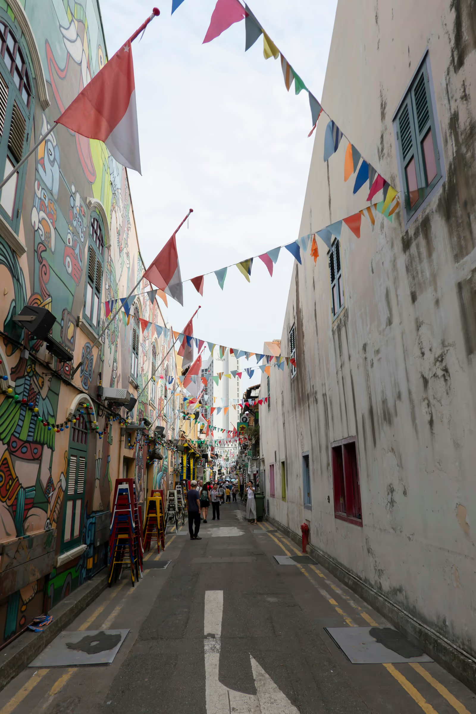





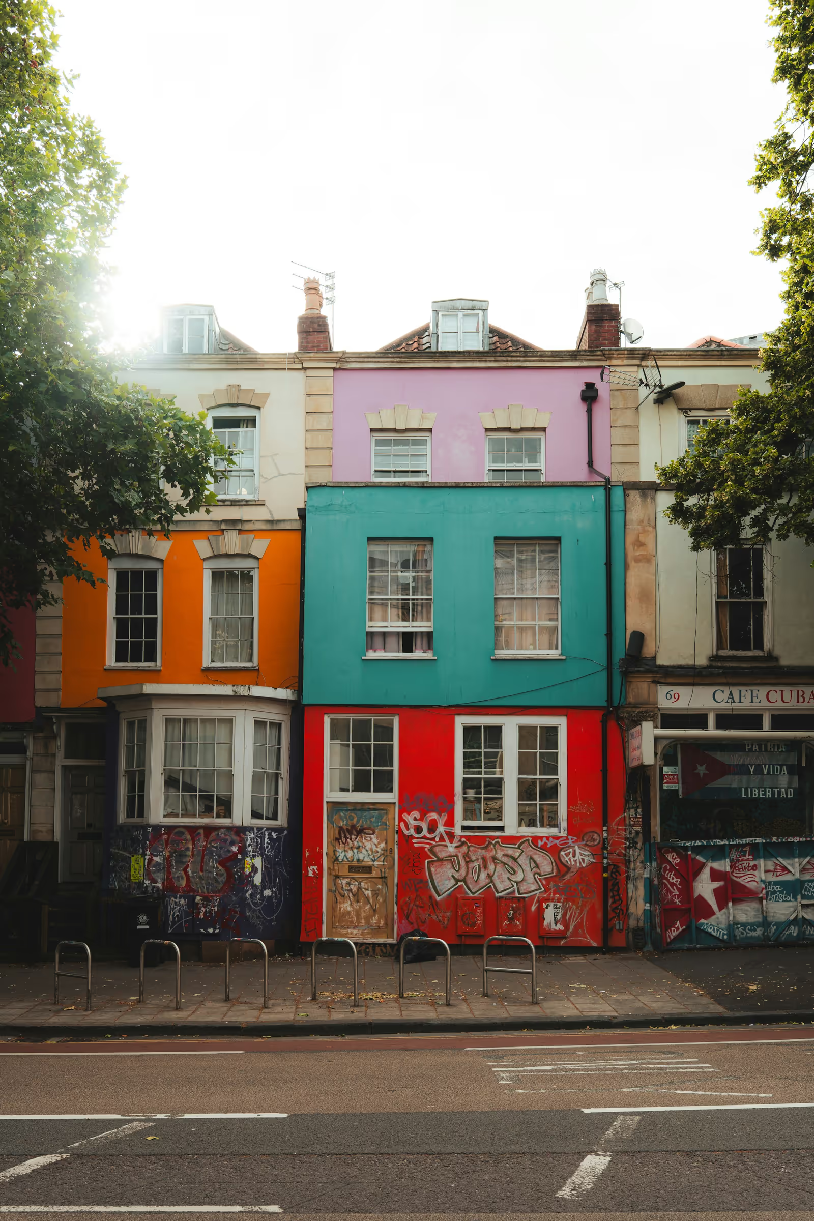
The sandbox is a Next.js App Router project with the files below. It serves its sample photos unoptimised, because the image optimiser’s native library cannot run inside StackBlitz’s in-browser Node.
What you need to know
| Question | Answer |
|---|---|
| Does it render on the server? | Yes. The trigger grid is plain markup in the HTML; the lightbox portal mounts on the client after hydration |
Do I need next/ with ssr: false? | No. Every entry point imports cleanly in Node. It is an option for keeping the lightbox out of the first bundle, shown below |
| Can the lightbox slides use the image optimiser? | Yes. Give each slide a srcset of / URLs, shown below |
| Where does the gallery live? | In a client component ('use client'), because it listens to clicks and gestures |
Can next/ be the thumbnail? | Yes. Wrap the <Image> in <LightGalleryItem>; the lightbox slide uses item.src |
| Where does the CSS go? | Imported once in the root layout, or any server component |
| App Router or Pages Router? | Both. The Pages Router needs no 'use client' directive |
| Remote images? | The lightbox slide is a plain <img>, so images.remotePatterns is only needed for the <Image> thumbnails |
Install
npm install @lightgallery/react lightgallery1. Styles in the root layout
The React package ships no CSS; the stylesheets come from the
lightgallery package. Import them once in app/layout.tsx:
// app/layout.tsx
import type { ReactNode } from 'react';

import 'lightgallery/css/lightgallery.css';
import 'lightgallery/css/lg-thumbnail.css';
import 'lightgallery/css/lg-zoom.css';

export default function RootLayout({ children }: { children: ReactNode }) {
    return (
        <html lang="en">
            <body>{children}</body>
        </html>
    );
}
2. The gallery as a client component
Static image imports give you the width and height for free, which the
lightbox needs for the open-from-thumbnail animation (lgSize). The
<Image> is the thumbnail on the page; the lightbox slide is the
imported file itself.
// app/Gallery.tsx
'use client';

import Image, { type StaticImageData } from 'next/image';
import { LightGallery, LightGalleryItem } from '@lightgallery/react';
import Thumbnail from '@lightgallery/react/plugins/thumbnail';
import Zoom from '@lightgallery/react/plugins/zoom';

export interface Photo {
    image: StaticImageData;
    alt: string;
    caption?: string;
}

export function Gallery({ photos }: { photos: Photo[] }) {
    return (
        <LightGallery plugins={[Thumbnail, Zoom]} thumbnail={{ animateThumb: true }}>
            <div className="grid">
                {photos.map(({ image, alt, caption }) => (
                    <LightGalleryItem
                        key={image.src}
                        href={image.src}
                        item={{
                            src: image.src,
                            thumb: image.src,
                            alt,
                            caption,
                            lgSize: `${image.width}-${image.height}`,
                        }}
                    >
                        <Image
                            src={image}
                            alt={alt}
                            placeholder="blur"
                            sizes="(max-width: 768px) 50vw, 25vw"
                            style={{ width: '100%', height: 'auto' }}
                        />
                    </LightGalleryItem>
                ))}
            </div>
        </LightGallery>
    );
}
placeholder="blur" shows the tiny blurred preview that comes with every
static import while the thumbnail loads. thumb is what the thumbnail
strip inside the lightbox shows; here it is the same file as the slide,
and the next section replaces both with optimised variants.
3. The page
The page stays a server component. It imports the images and hands the list to the gallery; static image data is plain JSON, so it crosses the server-to-client boundary as a prop.
// app/page.tsx
import { Gallery, type Photo } from './Gallery';

import mountains from './photos/mountains.jpg';
import forest from './photos/forest.jpg';
import coast from './photos/coast.jpg';

const photos: Photo[] = [
    { image: mountains, alt: 'Mountains at dawn', caption: 'Dolomites, Italy' },
    { image: forest, alt: 'Forest path', caption: 'Black Forest, Germany' },
    { image: coast, alt: 'Rocky coast', caption: 'Algarve, Portugal' },
];

export default function Page() {
    return (
        <main>
            <h1>Photos</h1>
            <Gallery photos={photos} />
        </main>
    );
}
A three-column grid is enough CSS for the page:
/* app/page.css */
.grid {
    display: grid;
    grid-template-columns: repeat(3, 1fr);
    gap: 8px;
}
Optimised slides through the image optimiser
next/image optimises the thumbnails on the page, but the lightbox
slide above is the original file. The slides can go through the same
optimiser: every lightGallery package renders an image slide’s srcset
and sizes as real markup, so a srcset of /_next/image URLs makes
the browser pick a resized AVIF or WebP for the screen it is on. The
candidate widths must be ones Next allows, which are the deviceSizes
and imageSizes from next.config.js; the values below are the
defaults.
// lib/optimized-slide.ts
import type { StaticImageData } from 'next/image';
import type { GalleryItem } from '@lightgallery/react';

// `images.deviceSizes` and `images.imageSizes` from next.config.js;
// these are the defaults. The optimiser rejects any other width.
const DEVICE_SIZES = [640, 750, 828, 1080, 1200, 1920, 2048, 3840];
const THUMB_SIZE = 384;

const optimized = (src: string, width: number, quality = 75) =>
    `/_next/image?url=${encodeURIComponent(src)}&w=${width}&q=${quality}`;

/** A lightGallery slide whose image comes from the Next.js optimiser. */
export function optimizedSlide(
    image: StaticImageData,
    alt: string,
    caption?: string,
): GalleryItem {
    // Never upscale: only candidates at or below the original width.
    const widths = DEVICE_SIZES.filter((width) => width <= image.width);
    return {
        // The original stays the fallback for a browser without srcset
        // support; every current browser picks from the candidates.
        src: image.src,
        srcset: widths.map((width) => `${optimized(image.src, width)} ${width}w`).join(', '),
        // The slide fills the viewport, so let the browser size for it.
        sizes: '100vw',
        thumb: optimized(image.src, THUMB_SIZE),
        alt,
        caption,
        lgSize: `${image.width}-${image.height}`,
    };
}
Use it where the items are built:
'use client';

import Image, { type StaticImageData } from 'next/image';
import { LightGallery, LightGalleryItem } from '@lightgallery/react';
import Thumbnail from '@lightgallery/react/plugins/thumbnail';
import Zoom from '@lightgallery/react/plugins/zoom';

import { optimizedSlide } from '../lib/optimized-slide';

export interface Photo {
    image: StaticImageData;
    alt: string;
    caption?: string;
}

export function Gallery({ photos }: { photos: Photo[] }) {
    return (
        <LightGallery plugins={[Thumbnail, Zoom]} thumbnail={{ animateThumb: true }}>
            <div className="grid">
                {photos.map(({ image, alt, caption }) => (
                    <LightGalleryItem
                        key={image.src}
                        href={image.src}
                        item={optimizedSlide(image, alt, caption)}
                    >
                        <Image src={image} alt={alt} placeholder="blur" sizes="(max-width: 768px) 50vw, 25vw" style={{ width: '100%', height: 'auto' }} />
                    </LightGalleryItem>
                ))}
            </div>
        </LightGallery>
    );
}
The zoom plugin takes the widest srcset candidate as the actual-size
reference, so the actual-size button and double tap behave as they do
with a plain image. One thing to know: a browser does not fetch a
larger candidate because an image was scaled up with a transform, so a
zoomed slide is as sharp as the candidate the browser chose for the
viewport, which sizes: '100vw' keeps at the full screen width. The
responsive loading guide covers sources
for art direction and the data-* form of the same fields.
Images from a CMS or an API
With remote images there is no static import, so the dimensions come
from your data. Build the items from the API response and keep
lgSize as WIDTH-HEIGHT of the full-size file:
'use client';

import Image from 'next/image';
import { LightGallery, LightGalleryItem, type GalleryItem } from '@lightgallery/react';
import Thumbnail from '@lightgallery/react/plugins/thumbnail';

interface Asset {
    url: string;
    width: number;
    height: number;
    alt: string;
}

export function RemoteGallery({ assets }: { assets: Asset[] }) {
    const items: GalleryItem[] = assets.map((asset) => ({
        src: asset.url,
        thumb: `${asset.url}?w=480`,
        alt: asset.alt,
        lgSize: `${asset.width}-${asset.height}`,
    }));

    return (
        <LightGallery plugins={[Thumbnail]}>
            {items.map((item, i) => (
                <LightGalleryItem key={item.src} item={item} href={item.src}>
                    <Image
                        src={item.thumb!}
                        alt={item.alt ?? ''}
                        width={480}
                        height={Math.round((480 * assets[i].height) / assets[i].width)}
                    />
                </LightGalleryItem>
            ))}
        </LightGallery>
    );
}
The <Image> thumbnails need the host in images.remotePatterns in
next.config.js; the lightbox slides do not, since they are plain
<img> elements.
Pages Router
The same component works under pages/. Drop the 'use client'
directive, import the CSS in pages/_app.tsx, and render the gallery
from any page.
Loading the lightbox on demand
Nothing above needs next/dynamic. If you want the lightbox and its
CSS out of the page’s first JavaScript bundle, split the gallery in
two: a small client component that renders the grid and remembers which
photo was clicked, and a lightbox component that next/dynamic loads
on the first click. The grid still renders on the server, and the
clicked thumbnail’s position goes to the lightbox as originRect, so
the open-from-thumbnail animation survives the split.
// app/LazyGallery.tsx
'use client';

import dynamic from 'next/dynamic';
import Image, { type StaticImageData } from 'next/image';
import { useState, type MouseEvent } from 'react';
import type { GalleryItem, LightGalleryProps } from '@lightgallery/react';

// Loaded on the first click, never part of the page's first bundle.
const Lightbox = dynamic(() => import('./Lightbox').then((m) => m.Lightbox), {
    ssr: false,
});

type OriginRect = NonNullable<LightGalleryProps['originRect']>;

export interface Photo {
    image: StaticImageData;
    alt: string;
    caption?: string;
}

export function LazyGallery({ photos }: { photos: Photo[] }) {
    const [mounted, setMounted] = useState(false);
    const [open, setOpen] = useState(false);
    const [index, setIndex] = useState(0);
    const [origin, setOrigin] = useState<OriginRect | null>(null);

    const items: GalleryItem[] = photos.map(({ image, alt, caption }) => ({
        src: image.src,
        thumb: image.src,
        alt,
        caption,
        lgSize: `${image.width}-${image.height}`,
    }));

    const show = (i: number) => (event: MouseEvent<HTMLAnchorElement>) => {
        event.preventDefault();
        // Where the slide flies out from and back to.
        const img = event.currentTarget.querySelector('img');
        const rect = (img ?? event.currentTarget).getBoundingClientRect();
        setOrigin({ left: rect.left, top: rect.top, width: rect.width, height: rect.height });
        setIndex(i);
        setMounted(true);
        setOpen(true);
    };

    return (
        <>
            <div className="grid">
                {photos.map(({ image, alt }, i) => (
                    <a key={image.src} href={image.src} onClick={show(i)}>
                        <Image src={image} alt={alt} placeholder="blur" sizes="(max-width: 768px) 50vw, 25vw" style={{ width: '100%', height: 'auto' }} />
                    </a>
                ))}
            </div>
            {mounted && (
                <Lightbox
                    items={items}
                    open={open}
                    index={index}
                    onIndexChange={setIndex}
                    originRect={origin}
                    onClose={() => setOpen(false)}
                />
            )}
        </>
    );
}
The lightbox component is the controlled form of the gallery with its own CSS imports, so the stylesheets load with it instead of in the root layout:
// app/Lightbox.tsx
'use client';

import { LightGallery, type GalleryItem, type LightGalleryProps } from '@lightgallery/react';
import Thumbnail from '@lightgallery/react/plugins/thumbnail';
import Zoom from '@lightgallery/react/plugins/zoom';

import 'lightgallery/css/lightgallery.css';
import 'lightgallery/css/lg-thumbnail.css';
import 'lightgallery/css/lg-zoom.css';

interface LightboxProps {
    items: GalleryItem[];
    open: boolean;
    index: number;
    onIndexChange: (index: number) => void;
    originRect: LightGalleryProps['originRect'];
    onClose: () => void;
}

export function Lightbox({ items, open, index, onIndexChange, originRect, onClose }: LightboxProps) {
    return (
        <LightGallery
            slides={items}
            open={open}
            index={index}
            onIndexChange={onIndexChange}
            originRect={originRect}
            onClose={onClose}
            plugins={[Thumbnail, Zoom]}
            thumbnail={{ animateThumb: true }}
        />
    );
}
The component stays mounted after the first open, so later opens are
instant and the close animation runs to the end. The cost is that the
first click waits for the chunk to download, about 19 KB gzipped for
the core plus the plugins you import. Keep the links’ href pointing at
the full image, as above, so the grid still works before the JavaScript
arrives.
Does the lightbox hydrate with the page?
The lightbox DOM does not exist until the first open, so there is nothing to hydrate and nothing in the server HTML beyond the grid. The plugins you import are in the page’s JavaScript bundle; import only the ones you use.
Opening the gallery from a button
Controlled mode skips the trigger grid: pass slides, own the open
state and the index. The React image gallery
demo shows it, and the
React package docs list the full prop surface. For video
in the lightbox, see the React video gallery.