 lightGallery
React image gallery component
@lightgallery/react is a native React image gallery: React renders every node, there is no wrapper around the vanilla library, and it works in Next.js out of the box. Pinch and double-tap zoom, animated thumbnails, captions, rotate, fullscreen and sharing all come as tree-shakable plugins. The full component API is in the React package docs.
Demo
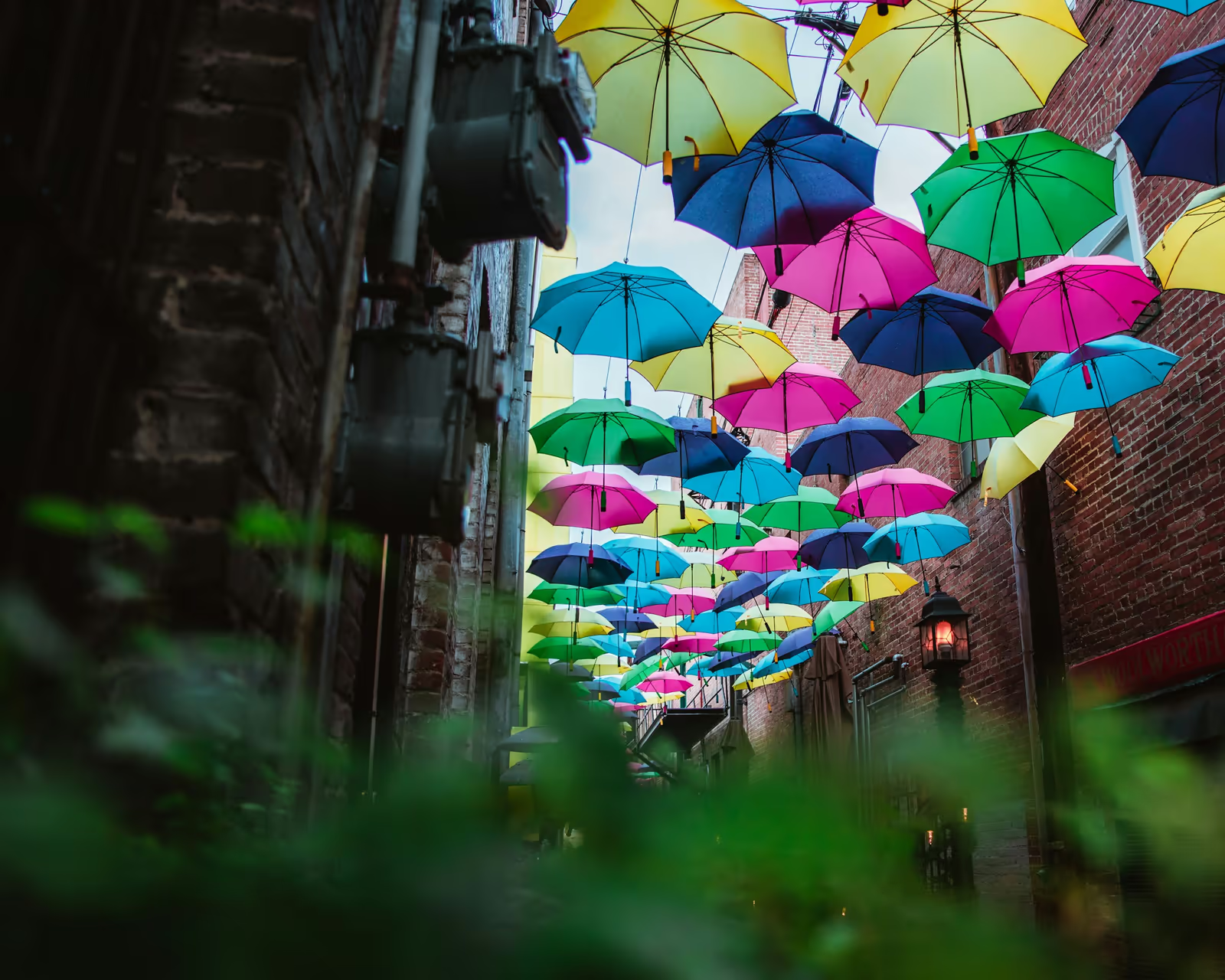
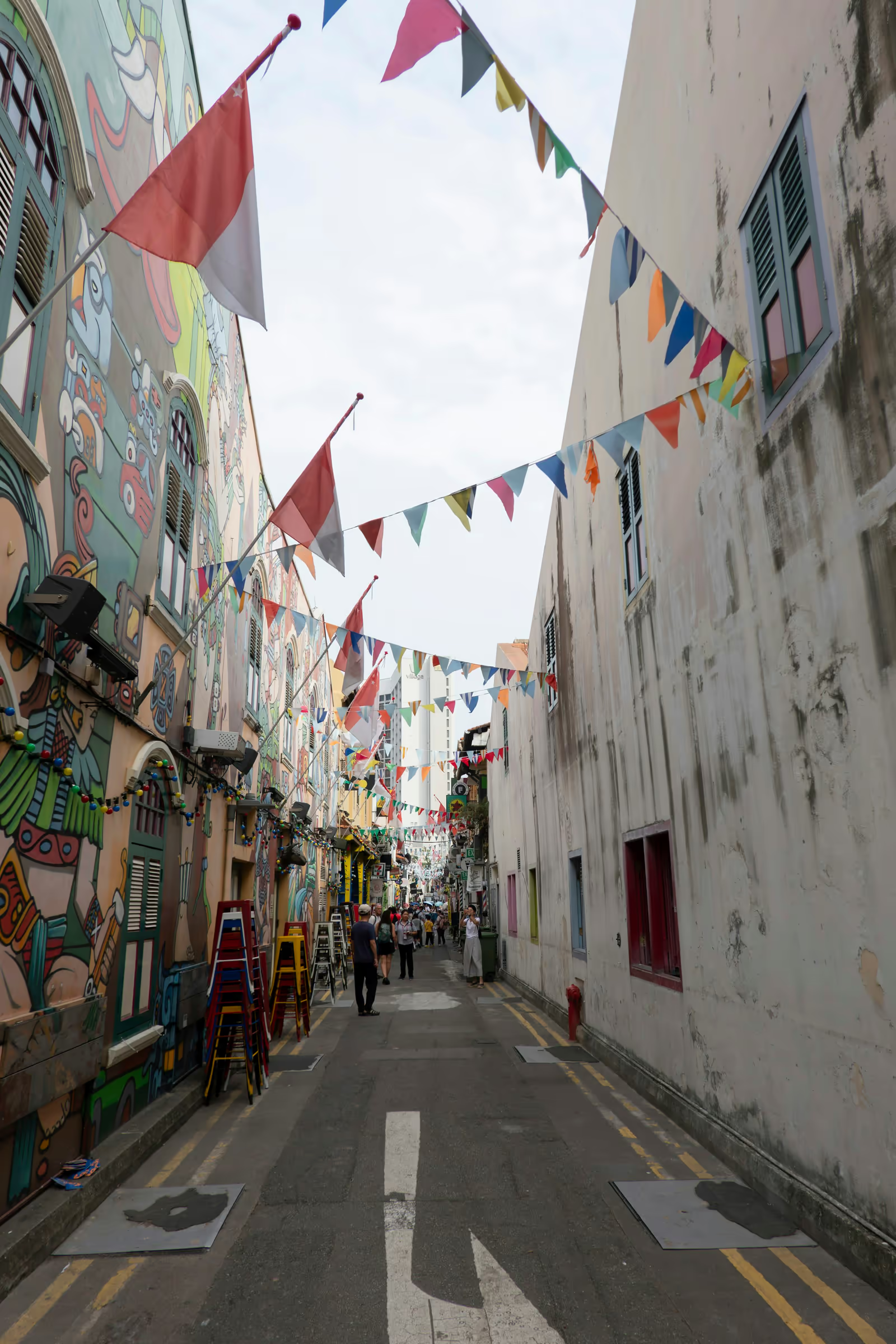
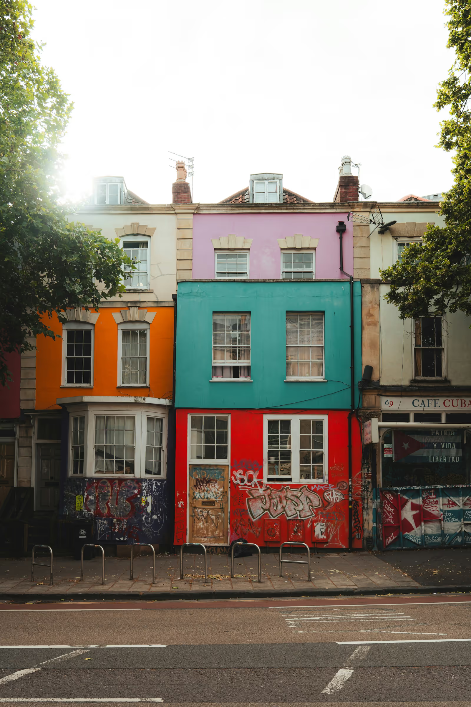
The gallery below is an actual @lightgallery/react component, every node
in the grid and in the lightbox is rendered by React.










Install
npm install @lightgallery/react lightgalleryThe React package ships no CSS, the stylesheets come from the lightgallery
package and are shared by every binding:
import 'lightgallery/css/lightgallery.css';
import 'lightgallery/css/lg-thumbnail.css';
import 'lightgallery/css/lg-zoom.css';
Thumbnail grid
Wrap your trigger markup in <LightGalleryItem>. Mount order is slide order,
the triggers server-render as plain markup (so the grid stays crawlable), and
clicking one opens the lightbox on that slide.
import { LightGallery, LightGalleryItem } from '@lightgallery/react';
import Thumbnail from '@lightgallery/react/plugins/thumbnail';
import Zoom from '@lightgallery/react/plugins/zoom';

const items = [
    {
        src: 'img/1-1600.jpg',
        thumb: 'img/1-240.jpg',
        alt: 'Mountains',
        // enables the zoom-from-origin open animation
        lgSize: '1600-1067',
        caption: <h4>Mountains</h4>,
    },
    {
        src: 'img/2-1600.jpg',
        thumb: 'img/2-240.jpg',
        alt: 'Forest path',
        lgSize: '1600-2400',
        caption: <h4>Forest path</h4>,
    },
];

export function Gallery() {
    return (
        <LightGallery plugins={[Thumbnail, Zoom]} zoom={{ scale: 1.5 }}>
            {items.map((item) => (
                <LightGalleryItem key={item.src} item={item} href={item.src}>
                    <img src={item.thumb} alt={item.alt} />
                </LightGalleryItem>
            ))}
        </LightGallery>
    );
}
Settings and plugins are props
Core settings are flat props with the same names as the vanilla library
(mode, speed, loop, preload, download, …). Each plugin contributes
one settings prop named after it, typed through the plugin’s own entry point:
<LightGallery
    plugins={[Thumbnail, Zoom]}
    speed={400}
    thumbnail={{ animateThumb: true, thumbWidth: 130 }}
    zoom={{ scale: 1.5, actualSize: true }}
/>
Enabling a plugin is the plugins array, a bare thumbnail boolean prop
does nothing on its own.
Controlled mode
Own the open state and the index yourself when the gallery is opened from
your own UI rather than from a trigger grid. The slides prop replaces the
trigger children:
const [open, setOpen] = useState(false);
const [index, setIndex] = useState(0);

<>
    <button onClick={() => setOpen(true)}>Open gallery</button>
    <LightGallery
        slides={items}
        plugins={[Thumbnail, Zoom]}
        open={open}
        onClose={() => setOpen(false)}
        index={index}
        onIndexChange={setIndex}
    />
</>;
TypeScript
The package is written in TypeScript and ships its own types, GalleryItem
for slide data, LightGalleryRefHandle for the imperative handle:
import { useRef } from 'react';
import { LightGallery } from '@lightgallery/react';
import type { GalleryItem, LightGalleryRefHandle } from '@lightgallery/react';

const items: GalleryItem[] = [
    { src: 'img/1-1600.jpg', thumb: 'img/1-240.jpg', alt: 'Mountains' },
];

const gallery = useRef<LightGalleryRefHandle>(null);

<>
    <button onClick={() => gallery.current?.openGallery(0)}>Open</button>
    <LightGallery ref={gallery} slides={items} />
</>;
The handle covers openGallery(index?), closeGallery(), goToSlide(i),
nextSlide(), prevSlide() and refresh(). Lifecycle events are callback
props with the documented names, onBeforeSlide, onAfterSlide,
onSlideItemLoad, and the rest.
Next.js and SSR
Every entry point imports cleanly in bare Node, and the lightbox portal
mounts after hydration, so no dynamic(() => …, { ssr: false }) wrapper is
needed. With the App Router, put the gallery in a client component and import
the CSS from your root layout:
'use client';

import { LightGallery, LightGalleryItem } from '@lightgallery/react';
The Next.js image gallery demo builds a
complete App Router page with next/image thumbnails.
More in the React package docs, SSR notes, the full prop surface and the accessibility behavior. See also the React video gallery and React carousel demos.