 lightGallery
lightGallery 3 is a complete rewrite, native in React, Vue and Angular
 Sachin Neravath
lightGallery 3 is out today.
I started lightGallery in 2014 as a jQuery plugin. Twelve years on, it runs in production at thousands of teams, among them many Fortune 500 companies, serves more than a billion CDN requests a month and is downloaded from npm over 400,000 times a month. I didn’t plan for any of that, and I’m grateful for every bit of it.
Version 3 is the largest release in those twelve years and the first complete rewrite. It was built around one goal. We want to make the best gallery we can for the web, for every framework, with the feel of a native gallery on a phone and on a desktop. Whether we’re there is for you to judge. What I can say is that 3.0 is the closest we’ve come, and that the gallery you already have keeps working while you decide.
The core doesn’t depend on any framework. React, Vue and Angular get native packages that render their own DOM instead of wrapping the vanilla one. The vanilla API is unchanged, so a 2.x gallery runs on 3.0 without edits. And the features people have asked for over the years, justified layout, virtualization, video facades, custom icons, localization and RTL, ship in every package at once.
Before the details, try it. The gallery below runs on the release build. Click any thumbnail.





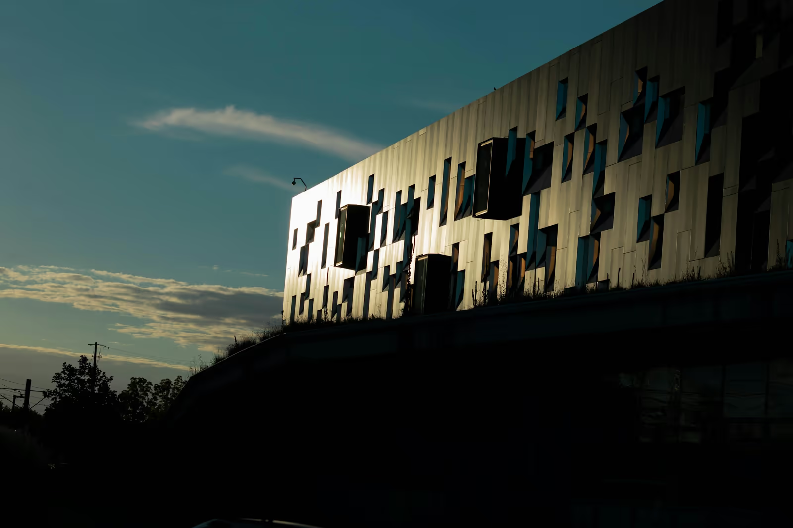


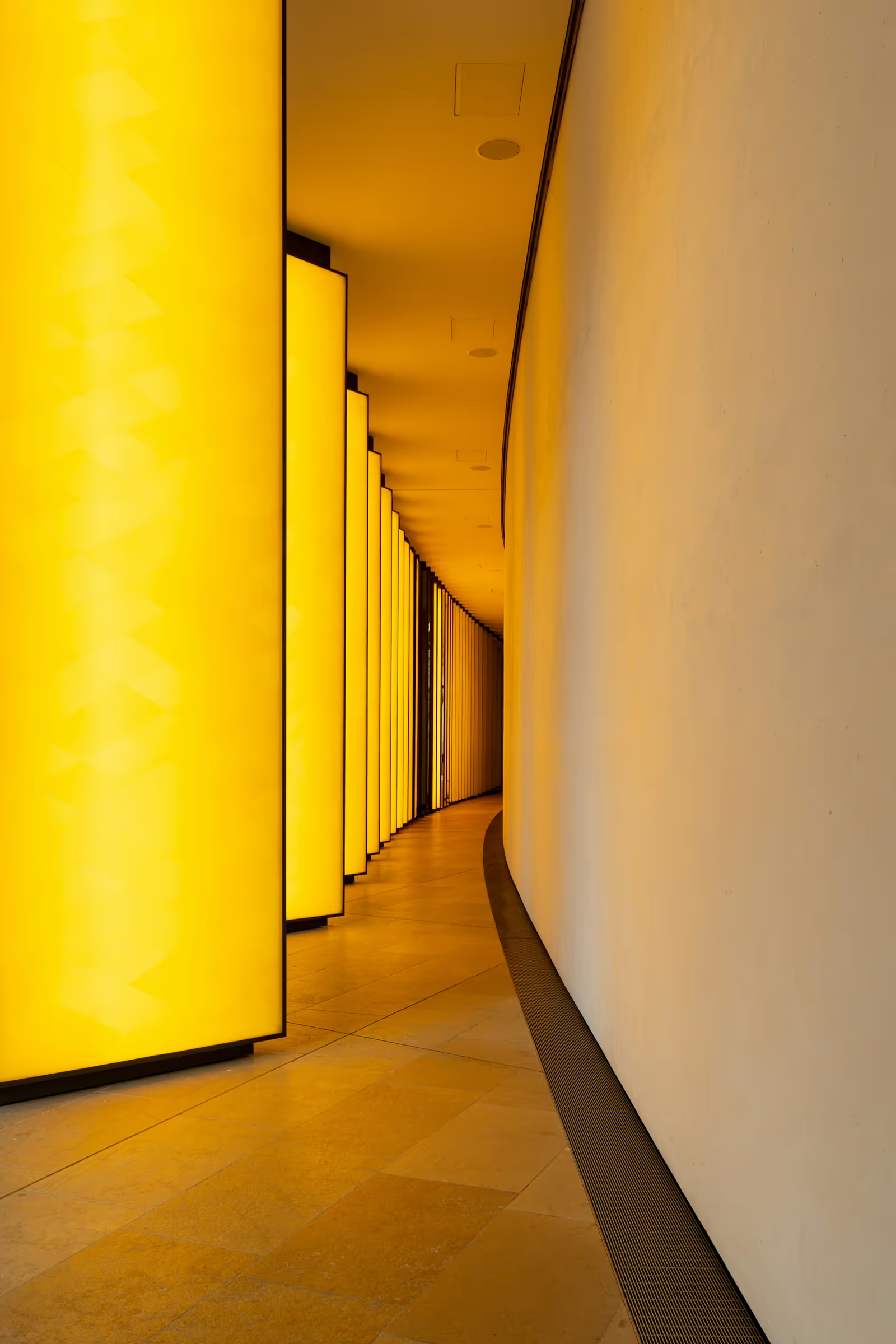














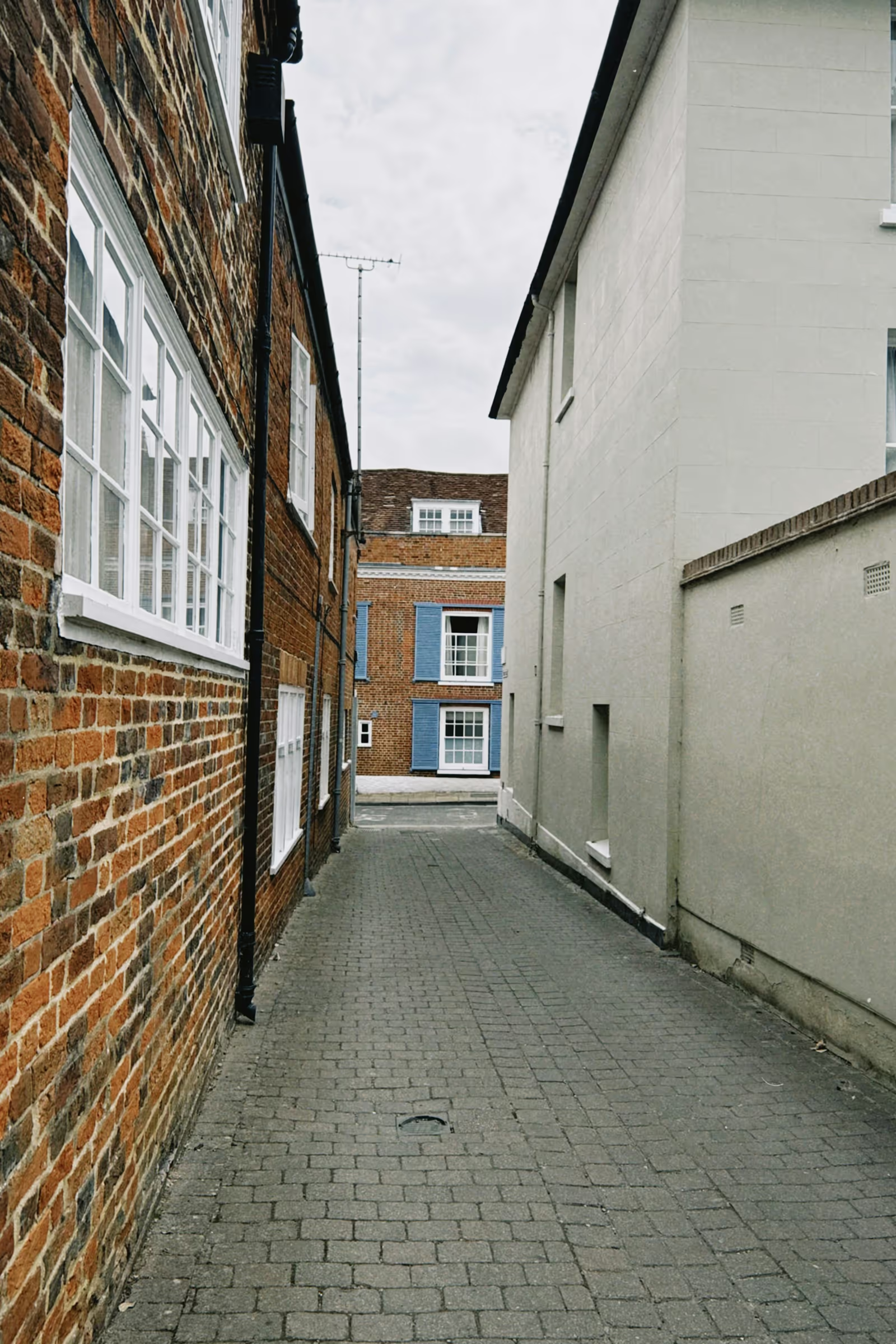
This is the gallery from the homepage. The grid is the new justified layout plugin, and the lightbox has thumbnails, zoom, fullscreen, autoplay, share, rotate and deep links enabled.
Native, not wrapped
In 2.x, the React, Vue and Angular integrations were thin wrappers. Each one mounted the vanilla runtime inside a component and let it build the lightbox DOM on its own. It worked, but the framework never owned that DOM, so state lived in two places, server rendering needed workarounds, and every wrapper lagged a step behind the vanilla package.
In 3.0 there is one gallery and four packages.
| Stack | Package |
|---|---|
| Vanilla JavaScript / TypeScript | lightgallery |
| React | @lightgallery/ |
| Vue 3 | @lightgallery/ |
| Angular | @lightgallery/ |
Each framework package is written for its framework, and the framework renders every node.
The React package has components, children or a slides array, callbacks with the documented event names, an imperative handle through ref, and a controlled mode (open, index, onClose, onIndexChange) that the wrapper never had. It works in the Next.js App Router as a client component, with no dynamic() wrapper. See the React guide.
The Vue package has <script setup> components, v-model:open and v-model:index, scoped slots for the caption and the controls, typed emits, and a Teleport overlay that never server-renders, so Nuxt pages hydrate without warnings. See the Vue guide.
The Angular package has standalone components, signal inputs and outputs, zoneless change detection, a CDK overlay and a with<Plugin>() factory per plugin. It works with @angular/ssr. See the Angular guide.
Settings keep their vanilla names everywhere. speed, mode or thumbWidth mean the same thing whether you pass them as a prop, a signal input or a settings object, so what you know from one stack carries straight into the next. The framework packages ship no CSS. The stylesheets still come from the lightgallery package, unchanged.
This is the same gallery, with two plugins, in all four stacks.
import lightGallery from 'lightgallery';
import lgThumbnail from 'lightgallery/plugins/thumbnail';
import lgZoom from 'lightgallery/plugins/zoom';
import 'lightgallery/css/lightgallery.css';
import 'lightgallery/css/lg-thumbnail.css';
import 'lightgallery/css/lg-zoom.css';

lightGallery(document.getElementById('gallery'), {
    plugins: [lgThumbnail, lgZoom],
});
import { LightGallery, LightGalleryItem } from '@lightgallery/react';
import Thumbnail from '@lightgallery/react/plugins/thumbnail';
import Zoom from '@lightgallery/react/plugins/zoom';
import 'lightgallery/css/lightgallery.css';
import 'lightgallery/css/lg-thumbnail.css';
import 'lightgallery/css/lg-zoom.css';
const items = [
{ src: 'img/1.jpg', thumb: 'img/1-thumb.jpg', alt: 'Mountains', lgSize: '1600-1067' },
];
export function Gallery() {
return (
<LightGallery plugins={[Thumbnail, Zoom]}>
{items.map((item) => (
<LightGalleryItem key={item.src} item={item} href={item.src}>
<img src={item.thumb} alt={item.alt} />
</LightGalleryItem>
))}
</LightGallery>
);
}<script setup lang="ts">
import { LightGallery, LgItem, type LgGalleryItem } from '@lightgallery/vue';
import Thumbnail from '@lightgallery/vue/plugins/thumbnail';
import Zoom from '@lightgallery/vue/plugins/zoom';
import 'lightgallery/css/lightgallery.css';
import 'lightgallery/css/lg-thumbnail.css';
import 'lightgallery/css/lg-zoom.css';
const plugins = [Thumbnail, Zoom];
const items: LgGalleryItem[] = [
{ src: 'img/1.jpg', thumb: 'img/1-thumb.jpg', alt: 'Mountains', lgSize: '1600-1067' },
];
</script>
<template>
<LightGallery :plugins="plugins">
<LgItem v-for="item of items" :key="item.src" :item="item">
<img :src="item.thumb" :alt="item.alt" />
</LgItem>
</LightGallery>
</template>import { Component } from '@angular/core';
import {
LgGalleryComponent,
LgGalleryItemDirective,
type LgGalleryItem,
} from '@lightgallery/angular';
import { withThumbnail } from '@lightgallery/angular/plugins/thumbnail';
import { withZoom } from '@lightgallery/angular/plugins/zoom';
// Styles go in angular.json: lightgallery/css/lightgallery.css,
// lg-thumbnail.css and lg-zoom.css.
@Component({
selector: 'app-gallery',
imports: [LgGalleryComponent, LgGalleryItemDirective],
template: `
<lg-gallery [features]="features">
@for (item of items; track item.src) {
<a [href]="item.src" [lgGalleryItem]="item">
<img [src]="item.thumb" [alt]="item.alt" />
</a>
}
</lg-gallery>
`,
})
export class GalleryComponent {
features = [withThumbnail(), withZoom()];
items: LgGalleryItem[] = [
{ src: 'img/1.jpg', thumb: 'img/1-thumb.jpg', alt: 'Mountains', lgSize: '1600-1067' },
];
}One core behind all four
Everything that makes a gallery feel like lightGallery now lives in one package of its own, @lightgallery/headless. It holds the state machine, settings resolution, the slide window and preload math, gesture verdicts, the zoom, thumbnail and rotate math, the justified row layout, the URL drivers behind deep links and the video URL builders. It has no DOM and no framework. Its TypeScript config excludes the DOM library, so window and document do not even type-check there.
import { createGalleryState, galleryReducer } from '@lightgallery/headless';

let state = createGalleryState({ slidesCount: 5, loop: true });
state = galleryReducer(state, { type: 'OPEN', index: 2 });
state = galleryReducer(state, { type: 'NEXT' });
Every package applies that core to its own DOM. A swipe threshold, a zoom clamp or a plugin setting behaves the same in vanilla JavaScript, React, Vue and Angular because it is the same code. If a gallery behaves differently after you migrate, that is a bug, and we would like to hear about it.
The headless package is public, so if your stack is Svelte, Solid or a web component, you can build your own binding on the same foundation.
What I wanted it to look like
I started my career as a designer, and for twelve years the thing I most wanted for lightGallery was for it to look and feel better. A lightbox is a frame around someone else’s work, and most of what makes a good frame is restraint and timing. Version 3 was the chance to work through those details one at a time.
The chrome gets out of the way. The toolbar stays on one row, and when it runs out of room it folds the buttons with the lowest priority into a menu instead of wrapping or shrinking. On touch devices it drops the zoom buttons, because pinch and double-tap already do that job, so there is less sitting over the photo. Every icon is an inline SVG that takes the button’s color, so the whole set changes weight and color together, and state pairs such as play and pause are swapped together.
Nothing is seen half built. The justified grid keeps thumbnails out of flow until the layout has positioned them, shows each box as a placeholder and fades the image in, row by row or image by image. A slide counts as loaded only once its image is decoded, so the first paint never flashes. The thumbnail strip no longer animates its first positioning and loads its images lazily, so opening a gallery from far along the strip lands on the right thumbnail with nothing sliding across. A video slide shows a poster until you press play, and only then loads the iframe.
Motion continues from your hand. Every release lands in a spring seeded with the velocity of your gesture. Boundaries resist with friction instead of stopping dead. Slide transitions used to crossfade the whole slide, so the outgoing image ghosted across the transition. Transform and opacity now keep their own durations. A cropped thumbnail grows into the full photo at a uniform scale instead of squashing the photo into the tile. And prefers-reduced-motion turns all of it off.
None of this needs a setting. It is simply how the gallery looks now, in all four packages.
What is new
Everything below ships in all four packages, with the same settings. The list is ordered by how much work each one took and how much you will notice it.
Gesture physics
Every release, of a swipe, a fling of the strip, a zoom pan or a drag to dismiss, lands in a spring seeded with the velocity of the last hundred milliseconds of your gesture. Motion continues from the speed you let go at instead of restarting from zero. A fling projects its landing point with the deceleration curve native scroll views use. Boundaries resist with friction instead of stopping dead. Catch a slide mid-spring and the next release starts from its live position. Pinch-to-close is new, and flickVelocity tunes how eager a flick is.
Zoom from origin, from cropped thumbnails too
The lightbox has always grown out of the thumbnail you clicked and flown back into it on close. Two things used to get in the way. A thumbnail cropped with object-fit: cover or background-size: cover shows only a window of the photo, so the flight squashed the whole photo into that window and stretched it back out on close. And dynamic galleries, opened from code, had the flight turned off.
Both are fixed in 3.0. The new origin crop plugin reads the thumbnail’s computed fit and grows that window out of the tile at a uniform scale, revealing the rest of the photo around it, then flies back the same way on close. It needs no markup or stylesheet changes. And a dynamic gallery now flies open from the element you pass to openGallery(index, element). See both on the zoom from origin demo.
Justified layout
Until now the thumbnail grid needed a separate layout library. The new justified layout plugin lays thumbnails out in rows of equal height that fill the container edge to edge, computed from the aspect ratios in data-lg-size. It reflows on resize, mirrors under RTL and doubles as the trigger grid for the lightbox. Thumbnails stay out of flow until the layout has positioned them, each box shows a placeholder, and the thumbnail fades in once it has loaded. The gallery at the top of this post is this plugin.
Virtualization
Galleries with thousands of items keep a small, constant DOM. With virtualization only the current slide, its neighbors and the visible thumbnails plus an overscan are mounted. Spacers keep the strip’s geometry identical to a fully rendered strip, so scrolling and dragging behave as they would with every slide in the DOM. The window advances at commit points, never per pointer move, so dragging costs nothing extra. It is a single setting and it is off by default. The 1,000-slide stress demo shows the mounted-slide counter while you navigate.
Thumbnail scrubbing
scrubThumbnails turns the thumbnail strip into a scrubber. Drag it and the gallery follows your finger with instant slide changes, all the way through the release glide. It is the interaction native photo apps have, and it pairs with virtualization for very large galleries.
Accessibility
The open gallery is a modal dialog with an accessible name. Focus moves in on open, Tab is trapped while the gallery is open, and focus returns to the trigger on close. A polite live region announces each slide change, every control is a real <button> with a localizable label, and prefers-reduced-motion disables the animations. The test suites of all four packages run axe checks against the WCAG A and AA rules.
Responsive loading
Slides render real responsive markup, with srcset and sizes on the image and a <picture> element when you provide sources, so format negotiation and art direction work exactly as they do in page markup. A slide counts as loaded only once its image is decoded, so the first paint never flashes.
Video facades
Provider video slides (YouTube, Vimeo, Wistia) used to render their iframe, and the JavaScript that comes with it, as soon as the slide was built. They now render as a poster with a play button, and the iframe loads only when someone presses play, so sliding past a video costs nothing. YouTube embeds go through youtube-nocookie.com by default. Both are settings, videoFacade and youTubeNoCookie, if you want the old behavior.
A toolbar that fits
The toolbar stays on one row. When its buttons do not fit beside the counter, the ones with the lowest priority move into a “More options” menu. Touch devices also leave out the zoom in, zoom out and actual-size buttons, because pinch and double-tap already do that. Open the gallery above on a narrow screen to see it. toolbarOverflow and showGestureButtons control both.
Custom icons
Every control icon is an inline SVG, and the icons setting replaces any of them by name. The icon font from 2.x is gone, together with its font files and @font-face rule, so there is one request fewer and no flash of missing glyphs. Icons follow the button’s color through currentColor, and state pairs such as play and pause are swapped together, so no state ends up without an icon.
Localization and RTL
Every label a visitor can see, in the core and in every plugin, lives in one strings object. Pass the keys you translate and they merge over the English defaults. direction: 'rtl' (or 'auto' to follow the page) plus the opt-in lg-rtl.css layer mirrors the navigation, the swipe direction and the chrome.
Sharing and deep links
On touch devices with the Web Share API, the share button opens the device’s native share sheet. Everywhere else it falls back to the classic dropdown. The Twitter target is now X. The hash plugin syncs deep links through the Navigation API where the browser has it, with the History API as the fallback. The URL format is unchanged, and stepping through slides never floods the browser history. hashDriver picks the engine.
A modern build
The packages target ES2017 and run in current evergreen browsers and iOS Safari without transpiling or polyfills. Internet Explorer is no longer supported, and v2 remains available for it. The vanilla package ships ES module and UMD builds with an exports map, so bundlers and Node resolve lightgallery/plugins/zoom or lightgallery/css/lg-zoom.css without deep path workarounds, and a plain <script> tag still works.
Plugins are separate entries in every package. Import what you use and the rest never reaches your bundle. The core is about 19 KB minified and gzipped, and each plugin only costs you when you import it.
TypeScript users get the types from the package entry, meaning the LightGallery instance, LightGallerySettings, GalleryItem and every event detail type. Typing a settings object or a plugin’s core no longer needs ReturnType.
Upgrading from v2
The migration guide has every detail. This is the short version.
Vanilla JavaScript
The API and the imports are unchanged. The icon font is gone, and custom icons replace it if you restyled glyphs. Internet Explorer support is gone too. Four defaults changed.
| Setting | 2.x | 3.0 |
|---|---|---|
videoFacade | eager iframe | true, a poster until play |
youTubeNoCookie | youtube.com | true |
preferNativeShare | dropdown | native share sheet on touch devices |
hashDriver | History API | 'auto', the Navigation API where available |
Every other new setting is opt-in. The per-plugin string objects such as thumbnailPluginStrings still work but are deprecated in favor of the single strings object.
React, Vue and Angular
Install the native package and keep lightgallery installed for the CSS. The wrappers scraped anchors for data-* attributes and took plugin settings flat on the component. The native packages take items or a slides array, one settings object per plugin, and the controlled and imperative APIs described above. The guide has a wrapper-to-native table for each framework, and the 2.x wrapper docs stay archived under /docs/v2/.
Licenses
A v1 or v2 key is not valid for version 3. The gallery keeps working and logs a warning asking you to upgrade. If you bought your license in the last six months, email contact@lightgalleryjs.com for a v3 key. Open source projects under a GPLv3 compatible license can use every package under the GPLv3, as before, and the temporary key lets you try everything before you buy. Plans are on the license page.
Docs for people and for coding agents
Every docs page now has a markdown twin at /docs/<page>/index.md, and llms.txt indexes them. The getting started page has a prompt you can paste into a coding agent. It points the agent at the guide for your stack and at the settings reference, which heads off the setup mistakes behind most bug reports. The repository also ships an agent skill for the same purpose.
Get started
- Getting started for vanilla JavaScript, and the React, Vue and Angular guides.
- Demos for every feature, with the code for all four stacks on each page.
- Settings, events and methods.
- The changelog and the migration guide.
Thank you
Twelve years is a long time to maintain anything, and I haven’t done it alone. Thank you to every maintainer and contributor who has reviewed code, fixed bugs, written docs and answered issues over the years. lightGallery is what it is because of you.
Thank you to everyone who bought a license. That support is what funds the development, and this release wouldn’t exist without it.
And thank you to everyone who reported bugs, tested the previews on their devices and asked, patiently, for the features above. This release is our answer. If something misbehaves in your project, please open an issue with the package and the setting involved, and we will look at it.